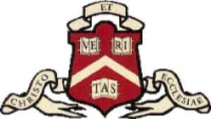
This is the Harvard shield with the Veritas motto, similar to the one used today (minus the clasps that were common on medieval books). The word VERITAS (Latin for 'truth') is broken up so it appears on the pages of three books. The third book has to accommodate three letters (TAS), which produces what is known in typography as a two-page spread -- one of the ugliest things to be observed in a publication, because the gutter goes straight through the illustration, in our case the capital A of TAS. Truly a sore sight. How did this even become possible?
The truth (don't know what to say about the status of the pun here) lies in the fact that originally the third book was actually facing the other way. The A in TAS therefore appeared priinted on the spine of the book. This design was supposed to represent the belief that truth is never known to us in its entirety. Otheres, however, argued that the third book was meant to encourage Harvard men to look at all sides of the problem, not juset at what is apparent. To complement this, the Harvard shield also had another motto (sometimes seen as forming a single sentence with "Veritas"): "Christo et Ecclesiae" (For Christ and the Church).

This design can still be seen on many buildings at Harvard, including the Widener library. At some point in the early XXth century it was decided that the third book should be turned the other way, to reflect the modernist belief in attainability of truth through progress. It is quite ironic that the resulting design was not exactly easy on the eye. The religious part of the motto was also dropped.
It remains to be seen, however, how soon the word Veritas would disappear from the shield. 'Truth' is simply not a concept favored by our postmodernist society. In the age of post-intellectualism the Harvard motto will soon look very outdated.